
(ESTIMATION TIME: 12 MINUTES)
UPDATE (03-Feb-2023): Psst, please have in mind this article is from…2019? 2020? Something around that…Anyway – A LOT has changed over the past years. So please take a minute and look at what’s going on right now here or here, or here. You can also check out my new project: No Code Masters on YouTube 😁
Long-awaited PowerApps Components [PAC] appeared on the end of January 2019 to everyone’s delight. From then on PowerApps developers can create their own controls that can be reused on a screen or across multiple screens and at the same time being central-manageable and migrate-able due to import/export option. PowerApps components can has it’s own custom properties (input and output) of multiple types which makes them really flexible. In this article I want to cover following topics:
- My own opinion on PAC
- 9 pros and cons of PowerApps Components
- PAC development patterns
- Referencing to PAC controls from within built-in properties
- Enforce proper setting default values for component
- Run event-driven component actions (OnStart,OnVisible,OnHidden,Reset)
- Run function outside component based on component behavior
I won’t cover step-by-step PAC creation in this article although presented patterns contains logic/code pieces. I plan to provide such tutorial in the future but until that time I refer to official tutorial.
PAC-math
I love PAC. Really. I use them in every new app of mine. And personally I think every PA developer should at least consider mastering PAC. Why? Let’s consider following PowerApp-math dissertation:
- PowerApp component = Multiple controls and mutual dependencies in 1 control
- Multiple controls and mutual dependencies in 1 control = less code + less controls
- Less code + less controls = lower app complexity
- Lower app complexity = faster development + easier maintenance
- Faster development + easier maintenance = Developer’s love
PowerApp component = Developer’s love.
Q.E.D.
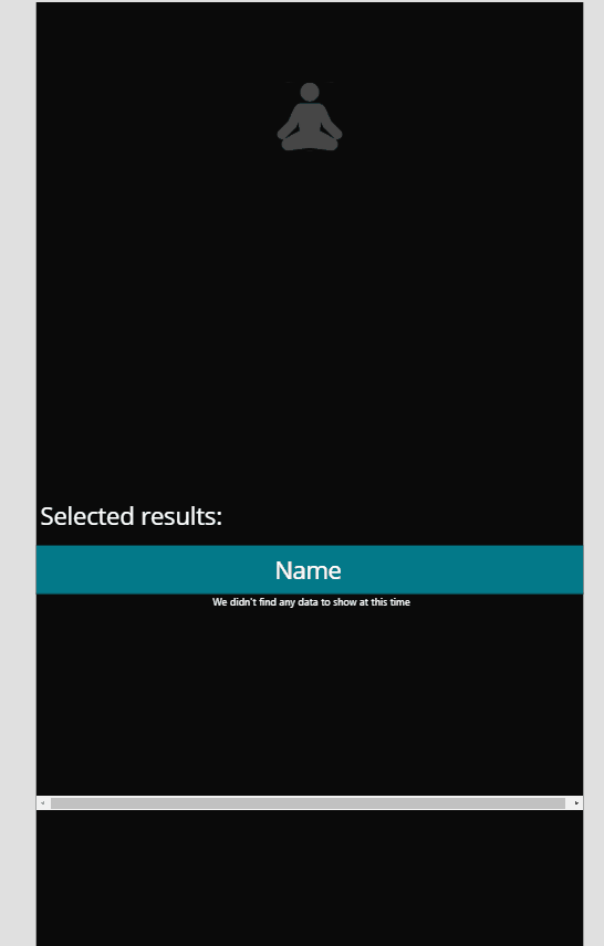
Below example shows image toggle control that is built from toggle button, 2 images (on/off) and glued with few lines of simple code.

Building 5 of above image toggles on a screen requires 5×3 controls and as much more of code. Now imagine you want each toggle to have different icon and still keeps to naming convention (tglMeditation, tglAnotherIcon etc.) for both controls and their variables. Seems like lot of work, right? And now assume that you need to change 3 icons to something different (remember about keeping naming convention!). Or even worse – you want to update image toggle control so it dims once clicked…and your app has 5 screens…and at least 2 of such controls on each…and…Ok, I stop here. You know what I mean :).
So now quickly analyse similar scenario using PAC. You use 3 controls + code + 4 extra custom properties (Image Toggle Default, Image Toggle On Icon, Image Toggle Off Icon, Value) and reuse the component 5 times which gives only 5 controls (PAC section is separate from Screens). No naming convention to keep (except in the component itself). Need to change icon? Easy, that’s why we’ve added custom properties for. Need to add dimming? Sure, we do it in one place (in PAC definition) and don’t care about the rest. Isn’t it beautiful?
9 pros and cons of components
PAC pros
Probably most of my readers are aware of following advantages of PAC but just in case some of you are not I’ll list them:
- Wrap up multiple controls
- Functions support
- Component scoped variables
- Input/output custom properties of any of following types:
Text, Number, Boolean, Date and time, Screen, Record, Table, Image, Media, Color, Currency - At any point of the time you can switch type of a custom property to any other type (no limitations like i.e. in SharePoint columns)
- Fetchable component size from within
- App scoped component
- Import/export option
- PAC is in preview: we can use it with confidence
PAC cons
Once you reach perfectness you’ll stop your development. Fortunately PAC is imperfect (as everything in the world actually) but as professionals we should be aware of both: pros and cons of a tool we’re mastering. In further part of this article I’m focusing on those imperfections, share knowledge of consequences they cause and how to overcome them.
PowerApps Components limitations are:
- Collections are not fully supported (key word: fully. They work to a certain point)
- Connectors are not fully supported
- Nesting a component inside gallery, form or a datacard isn’t supported
- No possibility to add media files to PAC package
- Unsupported referencing to PAC controls from within PAC built-in properties.
- Default values are wrongly set in specific situations
- No OnStart, OnVisible or OnHidden action for PAC means no simple way of setting default values in centralized way
- Unsupported executing functions in the context of the screen on which the PAC is embedded
- PAC is in preview: ok, that’s not really an issue but a inconvenience. Some features may not work as designed (i.e. undoing changes cause unexpected deletion of random custom property) and some minor bugs may appeared here and there.
Does everything from above bullet point list is a showstopper? Which of the above can be easily workarounded and which not? Let’s elaborate a bit on that.
Con 1: Collections are not fully supported
I’ve done simple test and confirmed that collections work at least in my example.

So when collections don’t work? What are the boundaries of a “not full support”? I tried to explore the topic but unfortunately I cannot find anything on it.
HELP ME: If you know in which scenarios collections are not working – please let me know in the comments below. I will update this article so others could make use of it.
CON 2: Connectors are not fully supported
So it is partly working. I couldn’t find any sufficient source in documentation, powerapps blog or powerusers forum but from tests I can confirm that:
- What works
- Trello, LinkedIn, Microsoft Flows. I didn’t check other connectors.
- What does not work
- static data from Excel, OneDrive, SharePoint Online. I was not able to reference them from within PAC.
HELP ME: If you know which connectors are not working in Components and why it’s now working (or maybe you just have another good explanation for that) – please let me know in the comments below so maybe we will be able to take the case on us.
Cons 3 & 4: No support for testing a component inside gallery, form or a datacard; No possibility to add media files to PAC package
I will be honest with you: for know there isn’t much you can do ¯\_(ツ)_/¯
Let’s hope it will be changed in the future. And by observing Microsoft progress on PowerApps development there is non-zero chance that it may happen this year.
PowerApps Components patterns
There are 4 more cons of PAC that I’d like to share with you. I’ve also prepared a PowerApps app with the described in this article components patterns as well as example use of them:
- Components Patterns contains components patterns like:
- Custom property reference pattern
- Default variable pattern
- Componenty inside action pattern
- Image toggle
- Customized Combo Box with Ok/Cancel option
- Confirmation Popup Component contains example of:
- Component outside action pattern
- App Guide Component contains example of:
- Default variable pattern
I’d be happy and proud if at least one person will make a use of them. I’m also encouraging you to contribute in this patterns – let me know if you have other ideas.
Referencing to PAC controls from within built-in properties
Problem
PAC con #5: “Unsupported referencing to PAC controls from within PAC built-in properties”
You want to achieve following behavior for your component:

Normally to make it works you would open your component properties advanced tab and use following formula in the Fill property:
If(Toggle.Value,Orange,White)I thought similar but once I’ve done it the result surprised me:

It occurred that I cannot reference to component controls or any variables from within component built-in properties (Fill, Width, Visibility etc).
Solution: custom property reference pattern
Fortunately component built-in properties can reference input/output custom properties so make use of this capability.
Steps to workaround:
- Add an input/output custom property with a proper logic in it
- Reference component built-in property to that custom property value
To finish presented background color switch I’ve added a custom output property of type Color. Then I’ve referenced to that property from Fill property of my component:

Example scenarios when this pattern may be useful:
- Hide component depending on its controls values (i.e. hide component once user pick an option)
- Change component background color based on its control value
- Resize component size based on its input data
Enforce proper setting default values for component
Problem
PAC con #6: “Default values are wrongly set in specific situations”
To make this con more understandable let’s consider following: you want to extend previous component (the one with changing background) adding default setting for component toggle.
Seems easy, right?
- Add custom input property of type Boolean
- Set toggle default value to Component.InputCustomProperty
You’re adding your component to the first screen of your app, set InputCustomProperty to ‘false’ (background should be white), save, publish, run app and…

Emm…ok…maybe there is something wrong. You check all settings twice, three times but no – everything is as it should be. Time for debugging. Let’s add extra toggles to the screen with your component and by using them let’s indicate input and output values of the component. Result?

What the…Oh boy…it seems like the output value of the component (and its background in consequence) refers to the value set in component instance (which you’ve added to the screen). From the other side the input value of the component refers to the value set in component definition.


SOLUTION: Default variable pattern
Theoretically setting InputCustomProperty value to false could solve the problem in this case but what if there will be more instances of this component and some of the should have InputCustomProperty set to true and some to false? So there is easier solution to that.
Steps to workaround:
- In component instance set InputCustomProperty to a variable i.e. gblDefaultValue
- On App start switch you variable to true and false like below:
Set(gblDefaultValue,true);Set(gblDefaultValue,false)Result:

Example scenarios when this pattern may be useful:
- Set component default visibility
- Preset multiple of component controls to specific values
- Define component size based on app resolution (in case of implementing custom responsive design)
- App like below (you can download it from here)

Run event-driven component actions (OnStart,OnVisible,OnHidden,Reset)
Problem
PAC con #7: “No OnStart, OnVisible or OnHidden action for PAC means no simple way of setting default values in centralized way”
Let’s start with following example: a component with 3 buttons (Green, Red and Default) set a color to component background each. There are also 2 extra custom properties: Default Color (input, color type) and Background color (output, color type).

This time for background I use rectangle shape. Output custom property formula is:

And the formula for rectangle color is:

Formula for Green button OnSelect action is:

Nothing spectacular so far. You change the color using buttons and the color is properly passed to the output value.
But now imagine you share this component to a colleague of yours. He played with it and…you received an email from him: “your component is not working properly. I set color for DefaultColor custom property but it’s not used until I click the button!

At first glance you might thought that setting Rectangle.Fill to Component.DefaultColor would resolve the issue but of course you’ll quickly notice that this would break the link between Rectangle.Fill and gblBackgroundColor variable.
Normally (I mean on screen level controls) you would use i.e. OnVisible screen event to set your rectangle.Fill to whatever is set for a default value. But PAC doesn’t have any event-driven actions. That’s why I would like to share with you with following pattern.
SOLUTION: Component Inside action PATTERN
Idea is this: add a toggle to your component and link it to some component input custom property. On toggle change run a formula you need.
Steps to workaround:
- Add input custom property of type Boolean to your component
- Add toggle button to your component
- Set toggle default value to ‘You-Component-Name’.InputCustomPropertyName (i.e. ‘Event-driven actions’.ComponentReset)
- Set toggle OnChange formula to anything you need. In my case it is following formula:
Set(gblBackgroundColor,'Event-driven actions'.DefaultColor)Result:

If you want to set many variables in Reset Toggle OnChange consider passing InputCustomProperty of type Record.
Example scenarios when this pattern may be useful:
- Expose less parameters to set and make your control more hermetic
- Below Additional Items picker component (you can download it from here)
Run function outside component based on component behavior
Problem
PAC con #8: “Unsupported executing functions in the context of the screen on which the PAC is embedded”
We can do almost everything using components except one part – context awareness. It means your component won’t know nothing about app nor screen that keeps it (however in case of a screen you can pass it to your component as parameter). In most cases that isn’t a problem but one specific action is noticeably missing: navigation. Simple as that.
The workaround lays not fully inside component but on the border of the component and screen in which it is embedded.
SOLUTION: COMPONENT outside ACTION PATTERN
For workaround we’ll make use of Component Inside Action Pattern but outside the component 🙂
Steps to follow:
- Add Output Custom Property of type Boolean to your component
- Add 2 buttons: Ok and Cancel that sets Output Custom Property to true and false respectively (of course via some variable)
- In the screen that embeds your component add a toggle
- Set the toggle default value to Output Custom Property value of your component
- On toggle OnCheck run a formula you need
Result (you can download ready component from here):
Example scenarios when this pattern may be useful:
- Navigate (of course)
- Control one component behavior based on another component output (like below)

The last word
Components are very powerful tool in PowerDev toolset. I encourage you to use them often – the mastery in using them will pay back quickly (even though PAC are going to evolve in the future to even more perfect form). Also remember that you can download and play with my components:
- All above patterns components
- App Guide component
- Additional Items component
- Popup confirmation component
I hope you enjoy this article.
Have a great coding.


Thanks. Some really useful content here (and across your site!). Great for a newbie to Power Apps.
One very small request: Microsoft doesn’t stand still and loves to fiddle with their cloud-based offerings, and the Power Platform is no exception. Please – Put the date when you publish your articles. It really helps readers to see what’s new, and also what’s old (and potentially out of date).
dope, it’s the first time I noticed it (the wordpress template I used doesn’t have dates in articles). But you’re 100% right. I’ll add dates to articles (ok, at least to this article :P)