(ESTIMATION TIME: 7 MINUTES)
PowerApps components appeared in the beginning of this year and so far are one of my favorite features. In a way they do not change anything – before PAC (PowerApps Components) developers were able to implement the same business logic in their apps. However from the other side PACs changed everything – developers are now able to create and reuse custom app parts which makes their solution cleaner, easier to maintenance and paced up the whole development process. In other words PAC are powerful tool in the hand of LCDP (low-code development platform) developers but unnoticeable for end-user.
In this post I want to show you one of my components and guide you through the process of creating it. Above all, please do mind I won’t cover what PAC is (here you can read great article about it) and I assume you have basic knowledge about PowerApps and PAC (if not, read this post first)
Step-By-Step Guide component
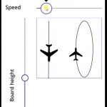
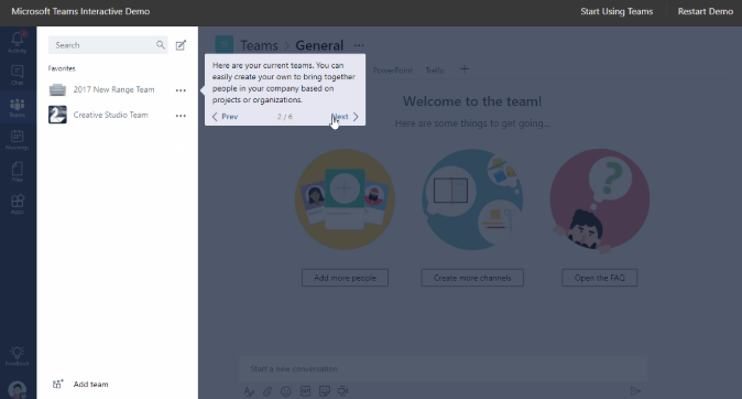
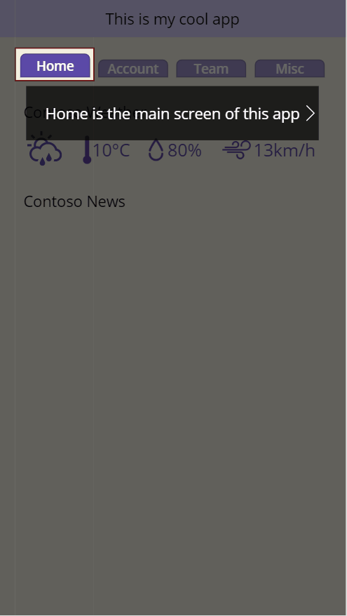
The component we want to build is an app guide/tutorial that describe the application sections to user that opens the app for the first time. For instance check an example of such guide below (the source comes from one of best of its kind: https://teamsdemo.office.com/)
We will use above example as an inspiration. Based on it we can note following features:
- Highlighted area
- Text box with instruction
- Next/Prev steps buttons
We already can imagine what kind of information our component will need:
- steps table
- current step information (to allow our component to communicate with PowerApps screen controls)
Knowing that we can break creation of our component to following steps:
- Main controls
- Semitransparent cover
- Component custom properties:
- (Input) Guide Steps Table
- (Input) Start step
- (Output) Current step
- Component controls dependencies
Main controls
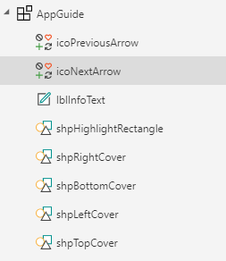
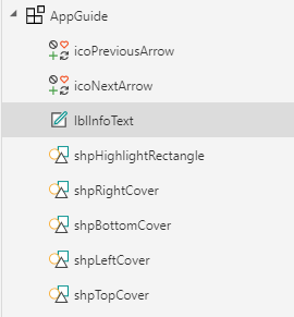
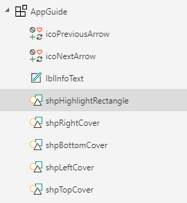
To add controls:
- Create new PowerApp > go to Components(1) > add new component(2) > add controls (3) as below. For arrows icons I used ChevronLeft and ChevronRight. To displaying description text I used simple label. However do mind I used a label control because of its configuration simplicity and the multiline text box control should work better.
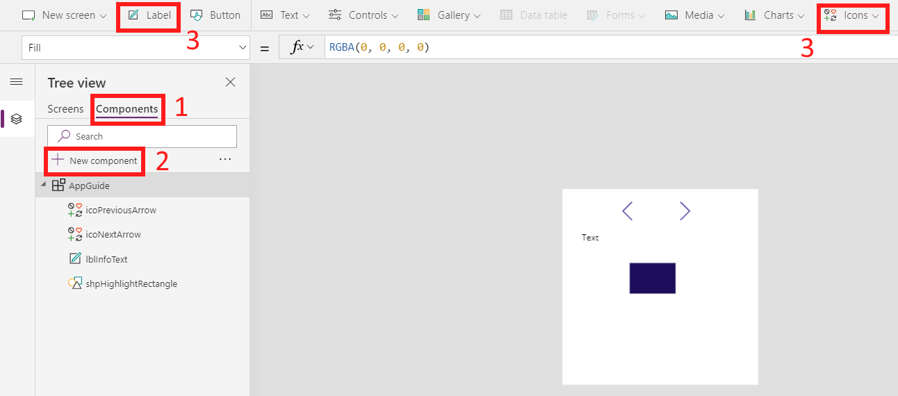
2. Now let’s add simple styling to our controls to make them more indicative. To do that I’ve made info text white on a bit transparent black background, white arrows and highlighting frame only with red borders (no fill).
lblInfoText: Color=White; Fill=RGBA(0, 0, 0, 0.7);
shpHighlightingRectangle: BorderColor=RGBA(168, 0, 0, 1); Fill=RGBA(0, 0, 0, 0)
3. At this moment we can also add our first simple logic. The logic will create
arrows position dependency from lblInfoText position. Moreover we can also snap lblInfoText to shpHighlightingRectangle bottom border
=========icoPreviousArrow=========
X=lblInfoText.X
Y=lblInfoText.Y
Height=lblInfoText.Height
Width=30
=========icoNextArrow=========
X=lblInfoText.X+lblInfoText.Width-icoNextArrow.Width
Y=lblInfoText.Y
Height=lblInfoText.Height
Width=30
=========lblInfoText=========
X=50
Y=shpHighlightRectangle.Y+shpHighlightRectangle.Height+10
Width=AppGuide.Width-100
Height=100
PaddingLeft = icoPreviousArrow.Width
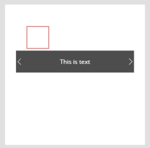
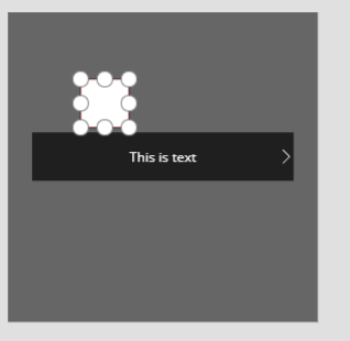
PaddingRight = icoNextArrow.WidthThat was easy. As a result your component should now look and behave like below:
Semitransparent cover
Now, let’s talk about semitransparent cover. As you may noticed on the Teams demo gif, every step highlights only part of the whole visible area, covering the rest with a semitransparent layer that ease user focus on only elements that are important in the current step.
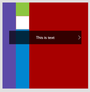
Achieving similar effect can be done using 4 rectangle shapes that fill all the space between screen borders and our highlighting rectangle. Below image visualize the idea:
To create such semitransparent cover add 4 rectangle shapes and configure it according to following setup:
=========shpRightCover=========
x=shpHighlightRectangle.X+shpHighlightRectangle.Width
y=0
Height=AppGuide.Height
Width=AppGuide.Width-shpHighlightRectangle.X-shpHighlightRectangle.Width
Fill=RGBA(0, 0, 0, 0.6)
=========shpBottomCover=========
x=shpHighlightRectangle.X
y=shpHighlightRectangle.Y+shpHighlightRectangle.Height
Height=AppGuide.Height-shpHighlightRectangle.Height-shpHighlightRectangle.Y
Width=shpHighlightRectangle.Width
Fill=RGBA(0, 0, 0, 0.6)
=========shpLeftCover=========
x=AppGuide.X
y=0
Height=AppGuide.Height
Width=shpHighlightRectangle.X
Fill=RGBA(0, 0, 0, 0.6)
=========shpTopCover=========
x=shpHighlightRectangle.X
y=0
Height=shpHighlightRectangle.Y
Width=shpHighlightRectangle.Width
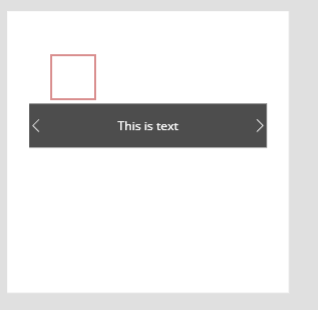
Fill=RGBA(0, 0, 0, 0.6) As a result, your component should now behave like below.
Disclaimer: along the place of covering rectangles contact there are visible white stripes. It’s kind of PowerApps bug which I’ve reported on PowerUsers forum and wait for the solution – please support it for the commonwealth good.
Component custom properties
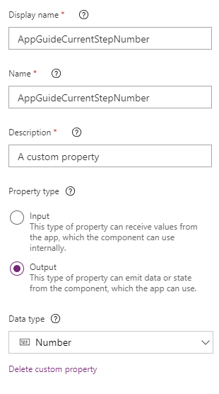
As we’ve already mentioned we need 3 properties:
- (Input) Start step – in case of situation when user would close application without finishing app guide. To be honest it’s optional and add a lot of if_else blocks to check if the StartStep value is blank. From the other hand it gives learning value so I decided to implement it anyway.
- (Output) Current step – important property. Based on its value the screen controls can change their visibility. You can also trigger an action (ie. change screen when user reach step 4) – to do that you can use component outside action pattern
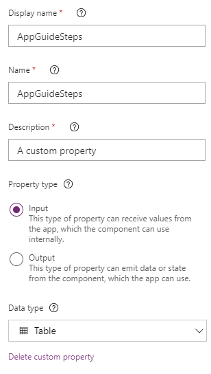
- (input) Guide Steps Table – Table that contains all information according to which the component will behave. However we don’t have single record scheme, so it is the right time to design it. For our needs I used below scheme:
- Highlight Rectangle X value
- Highlight Rectangle Y value
- Highlight Rectangle Width value
- Highlight Rectangle Height value
- Text – information text to display in info text control
- TextPosition – by now text block is below hightlight rectangle. But the text block will be out of screen boundaries if highlight rectangle will be on the bottom of the screen, right? So this field should indicate where the text block should be placed in relation to highlight rectangle position.
- Example single record:
{
  HR_X: 100,
  HR_Y: 100,
  HR_Width: 100,
  HR_Height:100,
  Text:"This is text",
  TextPosition:"Bottom"
}
Having everything planned we can start to implement it.
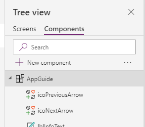
- On tree view select your component
2. Then add new custom property
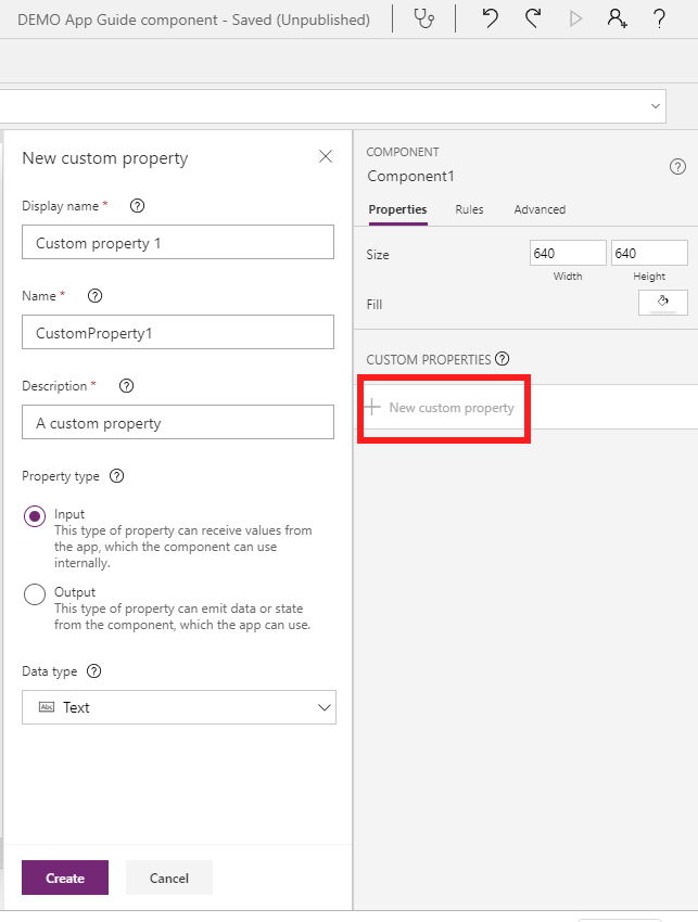
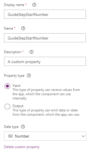
3. Then fill up the property form fields using below data
4. Finally, select component Advanced tab and fill the fields as below.
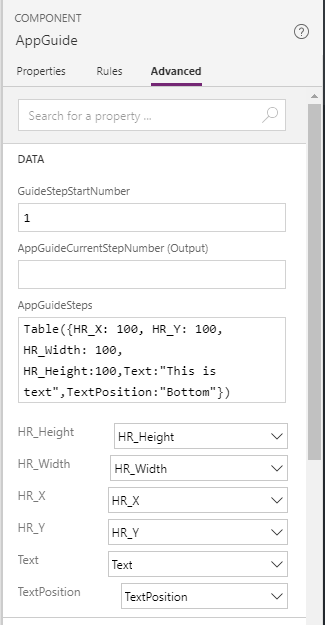
Important note
Adding sample record to custom property table allows later on to pick a record field ie. for some control value
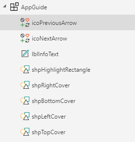
Component controls dependencies
Let’s begin adding dependencies in tree view controls order starting from the top. The next screens will indicate which controls will apply to the following code snippets. Code snippets are self-explanatory, rarely put comments explain a bit more complex logic
=========OnSelect=========
//GuideStepNumber - component local variable that keeps current step number
If(
    IsBlank(GuideStepNumber),
    Set(
        GuideStepNumber,
        AppGuide.GuideStepStartNumber
    ) - 1,
    Set(
        GuideStepNumber,
        GuideStepNumber - 1
    )
)
=========Visible=========
If(
    (IsBlank(GuideStepNumber) && AppGuide.GuideStepStartNumber <= 1) || GuideStepNumber <= 1,
    false,
    true
)
Important note
Create a note somewhere in a component what variables are you using and why – there is nothing similar to app variables that will list all component variables. I’ve posted an idea to create component variables section – vote for it if you agree it’s a good idea to have such component variables list
=========OnSelect=========
//GuideStepNumber - component local variable that keeps current step number
If(
    IsBlank(GuideStepNumber),
    Set(
        GuideStepNumber,
        AppGuide.GuideStepStartNumber
    ) + 1,
    Set(
        GuideStepNumber,
        GuideStepNumber + 1
    )
)
=========Visible=========
If(
    (IsBlank(GuideStepNumber) && AppGuide.GuideStepStartNumber <= 1) || GuideStepNumber <= 1,
    false,
    true
)
=========Text=========
If(
    IsBlank(GuideStepNumber),
//displays text field of AppGuideSteps[GuideStepStartNumber] element
    Last(
        FirstN(
            AppGuide.AppGuideSteps,
            AppGuide.GuideStepStartNumber
        )
    ).Text,
//displays text field of AppGuideSteps[GuideStepNumber] element
    Last(
        FirstN(
            AppGuide.AppGuideSteps,
            GuideStepNumber
        )
    ).Text
)
=========X=========
If(
    IsBlank(GuideStepNumber),
    Last(
        FirstN(
            AppGuide.AppGuideSteps,
            AppGuide.GuideStepStartNumber
        )
    ).HR_X,
    Last(
        FirstN(
            AppGuide.AppGuideSteps,
            GuideStepNumber
        )
    ).HR_X
)
=========Y=========
If(
    IsBlank(GuideStepNumber),
    Last(
        FirstN(
            AppGuide.AppGuideSteps,
            AppGuide.GuideStepStartNumber
        )
    ).HR_Y,
    Last(
        FirstN(
            AppGuide.AppGuideSteps,
            GuideStepNumber
        )
    ).HR_Y
)
=========Width=========
If(
    IsBlank(GuideStepNumber),
    Last(
        FirstN(
            AppGuide.AppGuideSteps,
            AppGuide.GuideStepStartNumber
        )
    ).HR_Width,
    Last(
        FirstN(
            AppGuide.AppGuideSteps,
            GuideStepNumber
        )
    ).HR_Width
)
=========Height=========
If(
    IsBlank(GuideStepNumber),
    Last(
        FirstN(
            AppGuide.AppGuideSteps,
            AppGuide.GuideStepStartNumber
        )
    ).HR_Height,
    Last(
        FirstN(
            AppGuide.AppGuideSteps,
            GuideStepNumber
        )
    ).HR_Height
)
Last thing is to set output property of our component
=========AppGuideCurrentStepNumber (Output)=========
If(
    IsBlank(GuideStepNumber),
    AppGuide.GuideStepStartNumber,
    GuideStepNumber
)
Component usage
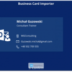
To use component go to App screens section and fill it with some example information. In my case I created mock up of dpt team app. Note that the visibility of the screen controls (ie. a gallery) can depends on the current guide step!
And that’s it! Congratulations! Your Step-by-step guide component is done! Now you can use it in your app or improve it by adding other features (ie. set dynamic info text height based on number of characters or replacing info text label control with multiline text box control)
References & Downloadables
I hope you’ll love PAC even more if you haven’t loved them enough yet. Also take below resources as a follow up of this article:
- 10 Reusable Components by Microsoft: tab control, calendar, dialog box, map control and more
- PowerApps components patterns that I developed during my PAC adventure
- Some of my own components:
If you like this post please share it – it helps others and motivates me 🙂